
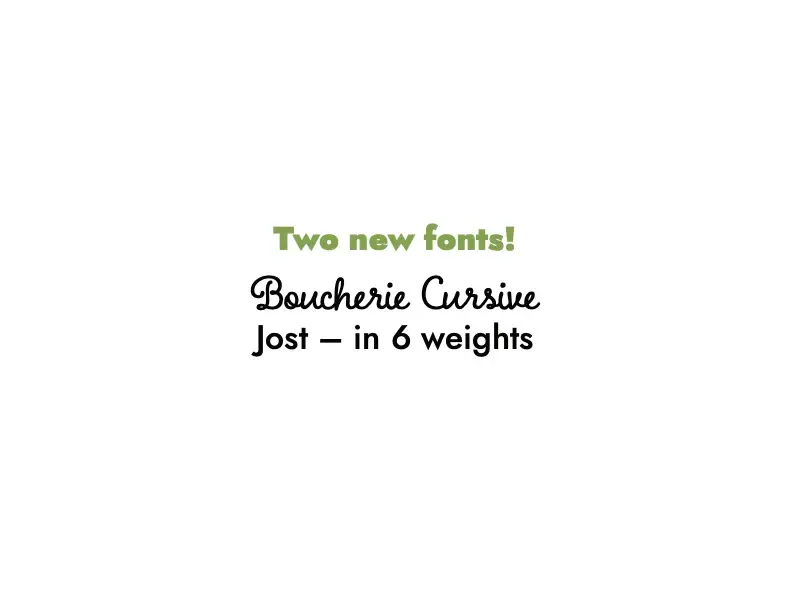
We’re continually searching for innovative fonts to enhance your Treering yearbook designs. Let’s dive into our latest finds that promise to add flair and readability to your projects.
Welcome Aboard, Jost!
Meet Jost, a clean-lined sans serif font that’s perfect for everything from headings to body copy. It’s a robust and versatile font that’s easy to read, featuring nice big round edges that command attention without overpowering the page. With seven weights ranging from Thin to Black, Jost offers diversity in style and emphasis, making it a fantastic alternative if you’re looking for a break from Arial.

Bonjour to Boucherie Cursive
Say “oo-la-lah” to Boucherie Cursive, a hand-written style cursive font ideal for secondary text like pull-out quotes and headings. What sets Boucherie Cursive apart is its open and upright style, with seamless character connections that make it exceptionally legible for a cursive font. It looks stunning when reversed out in a pull-out or caption box against a dark, classy background.

We encourage you to try Jost and Boucherie Cursive in your next yearbook project. Experiment with these fonts and see how they can enhance your designs—happy yearbooking!